HRV4Training Pro: Dashboard
User guide index: https://marcoaltini.substack.com/p/hrv4training-pro-user-guide
The dashboard provides you with a simple but effective tool to analyze trends and changes in multiple parameters at the same time, the radar plot. In particular, you can pick between 3 and 6 parameters, including resting physiology and subjective data, and the system will analyze how your data is trending in the current week, with respect to the prior month. This way, you can easily track progress or relative changes.
In the top panel, we can see data for today, such as the daily advice, HRV, normal range and subjective score:
The subjective score is a combination of the following: perceived sleep quality, motivation to train, muscle soreness, and perceived performance during previous workouts. Then these data points are averaged for the past few days. If you move the mouse on the subjective score, you can see the breakdown of the various parameters, or a subset of those if not all are used:
In the middle panel, we can see a simple but effective way to look at multiple parameters: the radar chart.
I believe this is more powerful than combined scores (readiness / recovery, which tend to hide information as you do not really know what has changed) or 0-100 scales that do not really represent how these parameters change over time.
Instead, here each parameter shows a relative change, e.g. your current week against your previous three weeks, and effectively shows you how you are trending, without relying on made-up scores or absolute numbers: the relative change is what matters.
When things are not going well, the color will change, e.g. below for a decrement in the overall trend of the selected parameters:
In terms of actionability, I think outputs (e.g. how you feel subjectively, as well as your HRV or heart rate), are more useful than inputs (e.g. your training load, sleep time, etc.).
This is why questionnaires and morning measures are important (they determine the outputs). This is also why readiness or recovery scores tend to be quite meaningless, especially for athletes, as they confound the response with behavior (e.g. if you train more or sleep less you get penalized, but did you really respond poorly, or is just the algorithm that thinks you should be tired?). I cover in more detail issues with those approaches, in this podcast.
Below is a list of the parameters that you can select for this visualization:
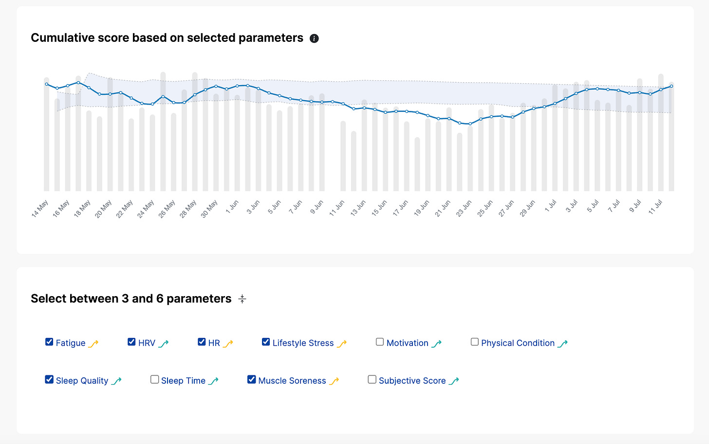
Finally, we have also added a plot of how this combined score changes over time, together with its own baseline and normal range:
and here is an explanation of what you are seeing:
I hope you’ll like the new Dashboard page and the improvements we implemented.
Please feel free to comment below in case of any questions or feature requests.
Thank you for your support.
Marco holds a PhD cum laude in applied machine learning, a M.Sc. cum laude in computer science engineering, and a M.Sc. cum laude in human movement sciences and high-performance coaching.
He has published more than 50 papers and patents at the intersection between physiology, health, technology, and human performance.
He is co-founder of HRV4Training, advisor at Oura, guest lecturer at VU Amsterdam, and editor for IEEE Pervasive Computing Magazine. He loves running.
Social:


